Villa at Whitefield

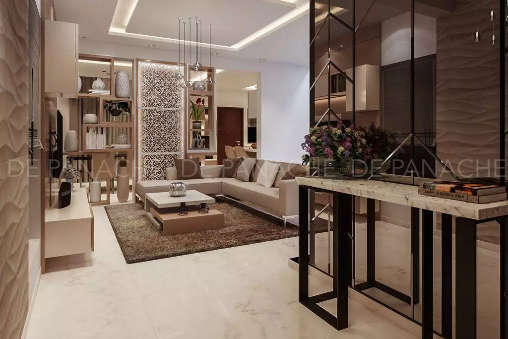
The entrance foyer has a beautiful console on one side of the wall supported by a bronze-tinted edge bevelled trapezoidal cut mirror reflecting the hand-carved stone on the other side of the wall.

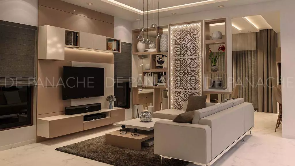
We gave the whole are an open concept where space is flowing into one another. The living room and the dining room have got a designer partition. The latticework has been designed like a partition for the living room being the puja room on the other side of it. The traditional skin ‘jaali’ is wrapped using lights and voids as a pattern-making tool. The see-through niches in between are acting as a divider partition. The interior design cost in Bangalore is also a major stakeholder while maintaining the theme balance in the home interior.

At the verandah we have put shoe rack seating niches to break the monotony of the typical shoe rack design, giving it a mirror edge to keep the knick-knacks. The whole living room has been completed in the soft tones of white and light brown, which provides a magmatic look for the entire décor. Complementing the shades are the lightings that enhance the beauty of the interior. Handmade stones paired with cove lights and mood lights are given to highlight the whole space. False ceiling and asymmetrical storage capacities have given the place the beauty to admire. The cove lights in between lighten up the entire area and create the perfect peace of mind and rest. The wall coverings to the centre table mark a difference and twin with the whole décor.

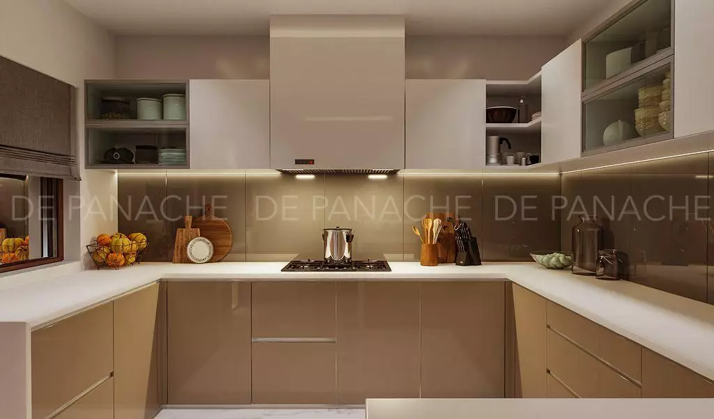
Going with the look of the entire décor, we have kept the open kitchen concept where the whole kitchen has been set up in a U-shaped pattern specially designed by kitchen interiors Bangalore. Here black painted glass has been used as a backsplash for kitchen. The kitchen has been given a breakfast counter to create a perfect mood for the owners.
This superb residence is a paradise in waiting, making the modern living both luxurious and practical. Dining tables, chairs and sofa are all made by imported Italian furnishings. Every detail stays true to the home’s form-meets-function approach. We have tried a give a carefully crafted and effortlessly chic look. Light wood furniture and kitchen cabinets contrast the white walls. The whole interior reflects a warm and serene mood enhanced by the soft colours. The entire utilities of the kitchen from the washing machine to the dishwashers to the crockery cabinets all have been set by our team, giving it a complete look and pairing them with the whole interior. The backsplash of the kitchen got a wonderful look, and all the cabinets are fixed with German fixtures having soft closing for better handling and smooth dealing. Shiny copper lights hanging above the dining table makes the place look more vivacious, and combinations of the colours in the room make it look very rich.
We wanted to use each corner of the use and give it is a perfect setting for a wonderful abode to live in and be proud of. Underneath the staircase we have made a beautiful seating area with extra storage facilities, giving it an asymmetrical shape.
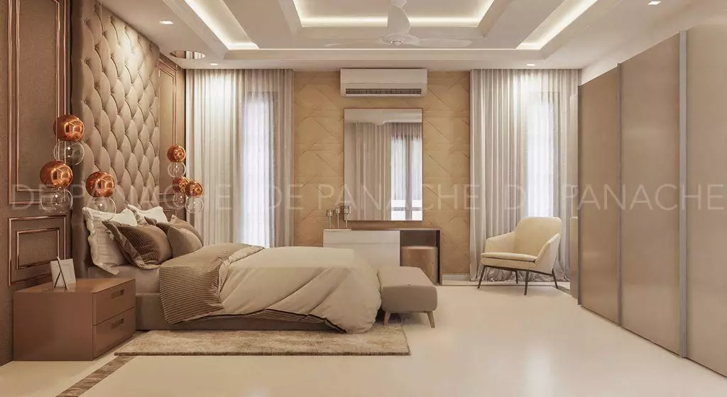
The bedroom room has been done keeping in mind the warmth of the house as well as the owners. Here no guests would feel out of their home. The backdrop has been given multiple layers of niches, all varying in-depth and the mood lighting creates a perfect environment as a whole. The wardrobe has been completed with German fixtures with soft closing, twining with it are the storage cabinets. The huge lights hanging at both the sides of the bed completes the elegant look of the whole décor. With high-quality plywood, we have customized the wardrobe and have given a chic look to the entire interior. Suiting to the needs of the guests, we have also provided a beautiful study cum storage cabinets. The bedside storages to the lampshades make the look richer, and the cove lights stand out to be the cherry on the cake.
We believe in creating art in every space we deal with, and going by this think we have created the master bedroom as a real piece of art. The neutral shades rule the whole space giving an enigmatic look to the whole interior. The use of grey as a dominant colour gives the spaces that shine and look, which would not have been possible otherwise. We believe in experimenting, and our experimentation with these rare choices make us unique and a master in the field. Brown and grey create an amalgamation of shades that people yearn for. Metal beading has been used in the headboard backdrop wall, and leather panelling has been as the headboard of the king-size bed. We were pairing with the décor the wardrobe has been given the same colour with soft closing shutters with storage utilities. We have provided the ceiling with panelling lights which creates the perfect mood for the entire décor. The entire house bears the stamp of a decorator with a keen eye, unconventional tastes and the ability to see potential in any space.
